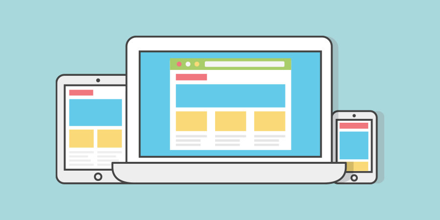
The approach RWD takes is to consider both design and development of the site and allow it to respond to the screen size of the user, thus removing the need for a second “mobile” site and offering a consistent user experience regardless of what device the website user uses.
When working with a web developer it’s essential to have a site that offers a good experience on all devices because many sites have a higher percentage of users visiting from a mobile device – mobile devices are anything that isn’t desktop.
This varies from industry to industry but many sites have over 80% of visitors using mobile, so if you don’t have a site that works well on a variety of devices then you could likely lose that user and potentially a sale or lead.
From an SEO point of view Google will be less favourable to sites that don’t offer a fluid mobile experience both with layout and of course website speed.
There are several ways to quickly check. You can of course try on your phone, tablet or other devices. You can also use a tool such as Responsinator which will give you an overview and allow you to gain an idea if your site looks as it should.
For those more confident, most browsers have a RWD mode which you can access from developer tools and basically give a similar output to the tool listed above.
If you have identified your site isn’t responsive that’s a good first step, you are now in a position to rectify the problem and make your site perform as well as it should.
I have a developer
If you have a developer already that’s great, speak to them and iterate your findings on your site’s mobile issues and your developer should be able to help you improve the site.
I use a cheap theme
If using a premade template, you can contact the template provider and ask for any updates or raise this as an issue or, alternatively, you can find a new template that is responsive.
I don’t have a developer or use a cheap theme
This is the worse case scenario and if you’re concerned about your site moving forward you’d need to find a skilled website developer to assist you in either working on your site to optimise and allow it to become a responsive website or create a new design with bespoke development to allow a consistent look and feel on all devices.
I personally offer bespoke design and development and all of my sites are fully responsive and offer users a great experience.
That’s ideal, a responsive site will help you offer great experiences to your users and shouldn’t impact your SEO or search engine rankings.
Don’t forget that nothing is perfect and you can always improve. As I mentioned earlier website speed is a key factor in ranking and retaining users. You may have a site that looks great on mobile but takes 10 seconds to load.
I’ve written about website speed in the past, learn more here.